I know that ‘freemium‘ is a popular business model at the moment, but do everyday web users really notice this when they’re using a site?
Personally I always assume a site is free and am surprised/annoyed when it isn’t, unless it offers something very compelling or a freemium model (the best, in my opinion, is Flickr). However a lot of sites put “free” in large type (including Trovix!) on their landing page. The only rationales I can think of (beyond the rare case that most other examples of your product are paid) split into two camps:
1) If you require an account to use the site, some people might think they will be asked for credit card details during the sign up. But how prevalent is this concern? It’s never come up in any focus groups or user testing. When directly asked, the people in my study groups were unanimous in the assumption it would be free.
2) It’s used as an attention grabbing bit of text that is intended to make the user feel like they are getting something (which should be a paid service) for free. This just feels tacky, and depending on how it is done, can detract from the brand.
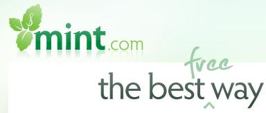
I was struck by Mint’s use of this tonight, which prompted this post:

Perhaps it is a cultural thing — I have seen many products that label themselves as ‘free’ in a scammy way. Regardless, unless everyone else is charging (or even if they are, like when Yahoo and Google introduced real time stock prices), it seems an unnecessary feature to draw attention to.
