One thing you can say about Google is its search results page has been known for its consistency and simplicity. The most radical addition was the poorly-received (by bloggers anyway) search wiki. Most changes have been behind the scenes — there has been a lot of additional complexity being continually added to the html source over the years, and plenty of tweaks with how the results are presented, their ordering, and the OneBox. Google had their unbranded playground, SearchMash, which recently was decommissioned, and they also bucket-tested very select features, but very little actually changed on Google.com. The site is certainly different to how it was 5 years ago, but it has been so gradual, it’s like watching someone you know age. If you look at a photo you can see the difference, but otherwise they look the same.
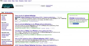
I’m not sure if it’s a direct response to the Microsoft/Yahoo partnership, but in the past few weeks Google appears to be taking broad steps towards changes that now benefit them rather than the consumer, while also pushing out new features. There was the recently revealed Caffeine, creating a strong connection between new features and the Google brand. They recently changed the landing page for Google.com, when signed into a Google account so that it defaults to iGoogle rather than the vanilla search page (giving me yet another location to have an unattended chat window open). The latter is most definitely an attempt by Google to keep users within their sites and expose them to new products (currently Google Latitude and Calendar are featured prominently on mine, even though I had previously customised iGoogle). Now Google have rolled out some tweaks to their search result page (which I am pretty sure are not being bucket-tested, as I’m sure I saw them tested a couple of years (!!) ago):

Click for a larger view
On the left in the red box is something I’m very surprised to see from Google and I was just thinking about the other week. Filters! Filters are a surprisingly difficult usability problem, and something I’ve spent a lot of time on. I’m pleased to see Google has put them on the left (something I believe is more natural to the user), and it’s also good to see they start minimized, but are still noticeable enough so that when you need them they are there. In this example, I was keen to see more timely details about the AT&T iPhone tethering, and was about to adjust my query when I noticed the filter box and was able to simply ask for results in the last week.
The green box on the right is a relatively subtle change. My guess is that given the prevalence of wide-screen monitors these days, the clicks on the ads were trending downwards (or perhaps their gaze-tracking machine noticed less eyeballs). As such they have brought the ads to come sit right next to your results.
However, the fact is that neither of these would be that interesting on any other site. My original title for this entry was “Google doesn’t stop innovating”, but Google has a tried and true formula, and I think it’s far more accurate to say that they are relentless iterators (at least when it comes to the UI). Now, if only they would implement the custom re-ordering of the navigation bar based on usage that I suggested to them…
