One important usability principle is to manage complexity for the user. This means both the UI itself, and contraining the data to prevent overload. Brandon Walkin wrote a nice article about managing complex UIs, but didn’t talk about managing complex data.
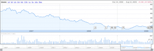
Usually Google does a great job in this field. Their onebox concept allows them to float up what they think will be most relevant to you in a small snippet. If they want to give you extra results, they just give you a few and clearly delineate the rest of your results. Google Finance does a really nice job of different zoom levels of data:

and when zoomed out:

It’s hard to tell the difference — which is deliberate. Google put in some very nice smoothing algorithms as well as doing a decent job on adjusting the scale and news for the stock.
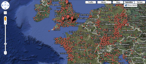
One thing that has surprised me is the increasing complexity to Google Maps. I’m not sure why they keep adding unverified user submitted datas and non-relevant photos, but they do. Now they provide so much information it’s essentially unusable:

I’ve also noticed lately that if I search for a particular destination, I usually get a large cluster of destination points, as well as an arrow actually pointing to my location (example below is of Massachusetts State House).

The top x data points is usually a good rule of thumb (depending on the size of the display between 10 and 25), or just show 1 if there is a high degree of confidence. I think Yelp does a pretty nice job with their map – giving you the option of retaining the original data, or updating the top 10, which keeps it nicely manageable.
