Cuil.com – the next Google?

From the way Mike Arrington carries on about it (oh and a bit more here too), you’d think so.  My initial impressions are quite different (to be fair, he does state “…it doesn’t appear to have the depth of results that Google has, despite their claims. And the results are not nearly as relevant“).

I started with the old vanity surfing evaluation.  I initially searched for plain old “cederman” (I’m number 2 on Google behind darn Lars-Erik at the moment!).

Searching for \

Very confusing list of results without any sort of rhyme or reason to them.  None of the vaunted contextual search options delineating between the few Cedermans on the web (there are only three or four of us, with three of us being published authors).  There are also some incredibly irrelevant results there, and why is an extremely old copy of my twitter page listed there, but not cederman.com?

“cederman-haysom”, “tim cederman” and “tim cederman-haysom” didn’t fare much better either.  Ouch, it’s not hard when there are literally only three cederman-haysoms in the world!

Anyway, whatever.  The true test of a search engine is looking for stuff that you actually want.  While TechCrunch did several broad searches (such as for “dog”, “apple”, and “france”), these are fairly rare in real world searches.  At the moment I’m planning a trip to Belgium, so I tried one of the cities I’m looking at accommodation for and trying to plan a tour of.

No results for Ghent on cuil

No results!  Search for the alternative spelling “Gent” only showed pages in Dutch.  The most curious aspect to this is that contextual search worked here.  The options shown up the top are valid Ghent related things you’d search for, and it’s actually really nice having them identified and clickable in this manner.  So why have “no results” for the main page?  Doesn’t make any sense at all…

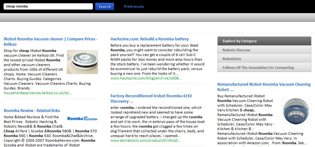
Finally, what’s with the ordering of results?  At first I thought I had to read sideways, in rows essentially, but the results don’t line up.  If I have to read by column, then I need to scroll to the bottom, and then all the way back to the top.  Without a sense of relevance, it’s very disconcerting, particularly if you’re searching for something you don’t know much about.  Sure it might help provide some users with a shotgun spray of results, but I think there’s a good reason why Google’s layout still works best.

As an example, imagine someone looking to buy a new Roomba:

Results for searching for a cheap Roomba on Cuil

While Arrington also states “I want to reemphasize that Cuil is only an hour old at this point, Google has had a decade to perfect their search engine.”  This is disingenuous to say the least.  Cuil is certainly not an hour old, and Google was VERY impressive when it first launched.

Still, I’ll have a close eye on what they do next.

Posted in Design, Startups, Web products | Tagged , , , , | Comments Off on Cuil.com – the next Google?

Best analysis of a PhD I’ve ever read

Found over at Jamie Lawrence’s blog.

I found myself nodding the whole way through.

I remember hearing that, on average, 1.6 people will read your PhD thesis. I’m pretty sure that includes yourself, your spouse, your supervisor, your second supervisor and your examiner (yeah, that’s technically 5 people. If someone says they’ve read your thesis, they’re probably lying – they read page 9). You have to accept, that no one in the world will want to wade through this document. Ever.

Oh, and the glorious days of a constantly clean house:

If you’re like me, when it gets down to the nitty-gritty, boring detailed work of the PhD, you need to remove as many distractions as you can because, at this stage, just about anything is going to be preferable to your PhD. Computer games, good fiction and the Internet are all obvious distractions that can be minimised. Washing up was one of my favourite distractions, which I never found a way to avoid.

Required reading for any potential PhD student.

Posted in Amusing | Comments Off on Best analysis of a PhD I’ve ever read

iRobot and lessons for design

It’s funny how something can be a great design, and yet with a few tweaks, it becomes completely awful.

Witness the Roomba.  I love my Roomba – I bought it in October 2006 when I moved in to my cottage and realised I needed a vacuum cleaner.  I bought the bottom of the line model, no accessories, and as of August 2008, with some minor maintenance it still runs great.  Even its battery, while definitely not as great as it once was, still has enough charge to clean the whole room.  It’s easy to use, cleaning it is very simple, and maintenance is also very user friendly.  And of course, it does a great job of cleaning the whole cottage (although I am lucky to have Roomba friendly floors and furniture).

With so much love for the Roomba, it was a natural choice to buy a Scooba as well.  I don’t mop and I could see grime building up.  Scooba was only $99 on Woot, so I bought one straight away.  I noticed immediately that it’s a lot bigger and heavier than Roomba, making it more difficult to move around and to manipulate while cleaning.  It doesn’t fit as nicely in our cupboard, and its increased height means the light sensor keeps getting caught under cupboard doors.  It leaks water when being moved from room to room, and will often insist to check the tank for no discernable reason.  There are a lot more parts to clean, and maintenance is a lot more complex.  Emptying it becomes a gross chore (instead of tapping a box into the bin, I usually manage to cop a bit of spray back when pouring out the dirty water).  When I lift it up, the tank often separates from the body.  I am struggling to get it to clean a single room at the moment with its myriad of problems, and it’s only 6 months old.  iRobot won’t support it because it’s refurbished.

Long story short, I’d never recommend the Scooba to anyone.  But I’d recommend Roomba in a heartbeat.

So how did they go so wrong?  There were several key areas:

  1. They identified an alternative niche and went for it at all costs.  I suspect their other products like the Looj will do better.  It seems like at no point someone wondered “will having <problem x> in addition to all the other problems mean people will just give up?”
  2. It’s overcomplicated to the point it can no longer complete its original purpose.  Mopping by definition is more complex than vacuuming because it is a 2 phase process.  However I can’t help but wonder if it would be more successful if they sacrificed some of the cleaning capabilities for simplicity.
  3. Too many choke points in the design.  The beauty of Roomba is it keeps working if some parts of it aren’t.  Scooba will fail if the tank connection gets clogged, if the hand-mixed formula is not done right, or if it detects a problem with its pipes.  One of these three things happens to me every time I try to deploy it.
  4. They forgot the Roomba design ideals.  It’s clunky, hard to use, makes a mess and has inherent design faults (such as a battery that fails after just a few months).  It was like they started from scratch without taking on-board any of the Roomba lessons.

I love domestic robots, but unless you’re really desperate, do not buy a Scooba.

Posted in Design, Gadgets | Tagged | Comments Off on iRobot and lessons for design

Random Wikipedia link of the day

Half plus seven graph

Half plus seven rule.

Posted in Amusing | Comments Off on Random Wikipedia link of the day

Web Usability panel

I just got home from a presentation organised by WebGuild which was a panel discussion on web usability.  Met lots of interesting people of course, but the highlight for me was of course hearing Tom Chi, Jeremy Ashley, and David Nelson talk about their experiences with Yahoo, Oracle and Adobe respectively.

First of all, it didn’t click with me that it was the Tom Chi, from Ok/Cancel, until he let loose his very dry sense of humour (I still enjoy sending my favourite comic to my engineering buddies).  He had some succinct and to-the-point answers to some of the questions for the panel which gave some great insight into his experiences, particularly with Yahoo and Microsoft.

I found it very interesting that when asked to define ‘ideal’ usability (in a round-about way), all three mentioned the ideals of ubiquitous computing – invisible, ubiquitous, effortless.  “You don’t even think about doing it.”

Another thing I agreed with was the changing face of traffic sources.  SEO and SEM is now king, while link sharing and ‘homepages’ are falling by the wayside.  I notice that in my own site traffic.  I have one site in particular I started in 2002, and until 2005 90% of the traffic was from link-sharing.  now 90% is from search engines.

I was happiest though, in answer to my own question, to hear the depth of ethnographic study at Oracle, which as a technical/engineering company I honestly did not expect.  Jeremy talked about the use of studies to gauge the integration of enterprise software in the grand scheme of things – such a holistic view of the user’s work practice was really refreshing.  Go Oracle!

Finally, I was intrigued that Yahoo! also makes use of ethnography (I didn’t expect it given the difficulty of observing casual users), specifically to build a connection between the design team and the users.  Tom discussed bringing a multi-disciplinary team so that different stakeholders could see the user as a tangible reality, not an abstracted target.  Creating a multidisciplinary team of which all members are involved in user studies is something I wrote about in my thesis as the benefits are it “destroys assumptions” (as seen with Tom, Jeremy and David), but for smaller projects also provides an opportunity to educate the user in turn.

All panel members agreed that ethnographic studies provided constant surprise.  I couldn’t agree more, which is why such close observation it is one of my favourite methods.

One thing this reminded me is that I have been somewhat lax in is getting the engineers further involved in the usability tests that I conduct.  While I make a live feed available, and encourage them to watch, next time I will have the key engineers come sit in for at least part of the session.  It really is quite eye-opening to see what the user really thinks of what you created.

Posted in Design, Usability | Tagged , , , | Comments Off on Web Usability panel

“Social layer” vs “Social network”

This afternoon we (Trovix) released Trovix Connect, the new version of our Trovix job portal. (incidentally, we’ve been using that as internal name well before Google Friend Connect and Facebook Connect!)

I feel like we’ve kind of jumped on the bandwagon of social sites.  However, I think this is more an example of responding to what people find useful rather than “everyone else is doing this and succeeding and so we’ll do the same”.

During user studies that I run periodically, one question asked is “how did you get your current job?”, followed by “what is your general strategy for finding a new job?”  While I don’t expect to get strictly accurate answers (an ethnographic study is much better for exploring true user activity), it is a nice broad question that reveals a significant amount of information so long as you frame and interpret it appropriately.

What was found is that most people use job boards as a supplemental source of information for finding jobs.  The majority of people (in the demographics we targeted) did not apply directly through advertised positions (such as on Trovix or CareerBuilder), but instead looked on the company’s site afterwards — or tried to find which of their friends had connections with the company and could help out.  I guess this makes sense as to why so many job boards rely on advertising revenue rather than taking a cut from direct applications.

With Trovix Connect, we tried to support this approach to job-seeking.  However, while creating a social network of friends and colleagues works for an ambiguous site like LinkedIn (where it is general career networking), Trovix is primarily a job matching service.  Job-hunting is obviously a fairly private activity, and a lot of the time you don’t want people to even know you have an account on a job site, let alone set up a connection with them.

Therefore we took a slightly different tack, and instead applied a social layer to the site. What this means is you can’t use your contacts in the normal social networking ways (what are my friends up to, what are all their details, how can I interact with them), but instead we track the network and use the information about it to support job seeking.  For example, if you were searching for a “Software Engineer” position in 94043, and you had me in your network, when the “Software Engineer – Trovix” position shows up, Trovix Connect highlights that you know me at Trovix and allows you to contact me about the position.  (Our resume parsing software automatically distills all your previous work experience automatically.)  We give the user an example email to send to their contact working at the company (or if they recently worked there) asking for their help.  In this way, people can use the same strategy for finding jobs as in “the real world”, but with connections they never knew they had.

Of course, privacy is a big deal to us, and you can opt out from appearing in search results.  You can also make your account invisible (in fact, that’s the default option!).  We have several spam-reducing features in place as well.

We really hope this will be a useful new layer to job-searching without being obtrusive or spammy.  If you end up trying it, please let me know what you think – I love to get feedback!

Posted in Design, Usability | Tagged , , | 1 Comment

Spamming users

One of the great things about Australia is we have a very strong department in the government called the ACCC.  The Australian Competition and Consumer Commission does a great job of keeping things fair in Australia between businesses and consumers.  While this can be seen as hampering free trade and an open market, they actually do a great job of keeping a “treat people fairly” mentality prevalent, and in practice there is great competition in Australia.

The ACCC help support other branches of government such as the Australian Communications and Media Authority with things like the 2003 Spam Act.  As per the ACCC, “Under the Spam Act it is illegal to send, or cause to be sent, ‘unsolicited commercial electronic messages’ that have an Australian link.”

What this means is even if you have a prior business relationship, if you haven’t explicitly stated “send me emails about stuff”, businesses are in breach of the act if they send you anything to do with a commercial site at all.

Since moving to the US I’ve noticed that on almost every site I use, if I give my email address I can expect to start receiving a decent amount of crap from that company.  For a lot of businesses it ends up losing them income in the long run by alienating power users who would otherwise use word-of-mouth to promote that business.

Lately I’ve noticed something somewhat sinister.  I’ve been trying to unsubscribe from websites and regardless of what I do, I remain on the lists.  Sometimes it’s because the company obfuscates the removal process (hi Mint – by the way, thanks for sending super-confidential details via email without asking me first!  Shame your site is so pretty, so I forgive you), but I’ve seen several examples of late where the unsubscribe is just plain broken.

So let me name and shame some people.

The worst two:

Lee Jeans is a shocker.  Unsubscribe link that does nothing at all.  I had to add them to a deletion filter, as numerous emails to members of staff did nothing to resolve this.  Even mention of the Spam Act did nothing to help.

JobFox.  Ahh, JobFox.  I tried everything I could to unsubscribe from JobFox.  I edited all my preferences, I clicked on links, I emailed the helpdesk, and then I even emailed individual members of their team.  Nothing.  Also added to the deletion queue.

Then there are a whole bunch of smaller sites (Hi DavinciTeam).  Thankfully some startups at least listen when you write to them.  I got a very impressive response from Mixx via the Director of Product Management, Will Kern:

I wanted to let you know that this has been taken care of.  You will no longer receive marketing e-mails from Mixx.  Let me know if there is anything else I can help you with.

Me: Thanks very much – and thanks for letting me know too (and on a Saturday no less!).

Will: You are most welcome!  Saturday, Sunday, Tuesday, who keeps track ;-)

Very pleasant and prompt.  You guys are definitely back in my good books!

Workology also had a similar bug, but again, I got a prompt, helpful response which was great.

Finally, I wish I could remember the name of the site who had an unsubscribe link to nowhere.  Checking back a couple of weeks later and there was a page but with no options on it.

Update: Just remembered.  Stumbleupon.  I never did get a reply from your customer service team either, although thankfully the emails stopped.

All of this begs the question, why do so many companies have broken systems?  Is it a deliberate thing?  Is QA behind the ball?  Am I just unlucky?  Inquiring minds wish to know.

All I do know is it really hammers home just how underappreciated the asynchronous user experience is.  Incorrect or poorly timed emails, slow-to-arrive confirmations, sensitive information, spam, and poor control of all of this can have a huge effect on the user experience of the site.  While this part of design for a new application usually comes late in the process, it doesn’t mean it should be treated as an afterthought or not part of the user experience.

Posted in Consumer issues, Usability, Web products | Tagged , , | Comments Off on Spamming users

Silicon Valley pictures

Some photos from around the Silicon Valley area.  Apologies for the quality, but they’re all from the iPhone.

The Computer History Museum presents – the original Utah teapot:

Utah Teapot

The Crittendon end of the Google campus – you can see NASA Ames in the background (and Hangar One):

Crittendon Google and NASA Ames

Check out the numberplate:

Ethernt numberplate

This one is a little harder to see, but it was taken near Google:

Writely numberplate.

(it says “WRITELY”)

Posted in Bay Area | Comments Off on Silicon Valley pictures

Bubble 2.0

Annoying parodies aside, this is pretty spot-on.

[youtube:http://www.youtube.com/watch?v=I6IQ_FOCE6I]

Posted in Amusing, Bay Area, Startups, Web products | Comments Off on Bubble 2.0

The curse of updates

One of the worst things about the ubiquity of the internet is the crutch of automatic updates.  Who cares if our code isn’t feature complete?  So what if there are bugs galore?  It works okay – let’s ship and just put out an update.

And thus we are now stuck in the bane of the update.

The worst offender is easily Adobe with Reader.  PDF – Portable Document Format.  Its name conjures up images of lightweight, portable and universal means of viewing a document.  Sadly since Reader 8 or so we have been cursed with updates every few weeks.  And the worst part is the Adobe Updater is an extremely belligerent piece of software, that INSISTS you update.  The worst part is that in providing ‘flexibility’, Adobe have allowed partial updates to plug-ins and the like, and so any minor change in any part of Reader requires a virtual reinstall of the software.

I still find the most galling aspect of it the fact that they have considered the use case.  Some average Joe gets sent a PDF, tries to open it, and then Adobe Reader suddenly realised “oh wait, you need to update”.  All right you say, let’s just get it out of the way, and you click next.  “Wait a minute, you want me to UPDATE this software while it’s  STILL RUNNING?” cries Reader.  And all of a sudden you have to completely break focus, allow it to close reader, and start again.  The worst is when you’re doing this from within a browser.  How on earth did this make it past user testing?

Tonight I wanted to play some Rock Band with my brother.  It’s been maybe a week since I booted my PS3, and at most 2 weeks since an update.  Before I can do *anything* online, “oh ho ho, what do you think you’re doing?  You need to update! You might be running a hacked firmware and we can’t allow you to do anything online.”  Seriously, how has this become acceptable?  The worst part of this is Sony’s download code for the PS3 is abysmally slow – it took half an hour to download and install the new updates.  In fact, it’s almost twice as fast to just download updates on my laptop, copy them to a memory card, and then go through the hullabaloo that is required to do a non-standard install.  And for what?  A few bug fixes and some unknown feature I’ll never use?  To top it all off, several of my games then required individual updates as well.

Although both of these are obnoxious, at least with Adobe you can reject and disable updates easily, and with the PS3 you are still allowed to play locally.  The truly obnoxious updater is Apple’s “Software Update”.  Hey, here’s an idea – let’s push products people don’t want as part of the update process.  Better yet, let’s set this up so it’s extremely difficult to disable it.  Apple did a fantastic job of obfuscating the disablement of updates, which offered my Windows PC little to no benefit (I leave them enabled for my Macs).  Searching through the registry, start up menu and MSConfig turned up nothing.  Googling the problem turned up this gem – it’s a scheduled action instead.  You need to go to your scheduled tasks (of which I have no others) and delete it from there.

So what rules for design can we take away from this horrendous user experience?

1 – Allow updates to be disabled easily.  Not everyone wants the latest and greatest (indeed, many times it is necessary to stick with an old version as I discovered when Apple updated Quicktime and broke my video camera’s ability to view its own files)

2 – Reduce the schedule of updates.  Updates are important, but make sure they’re *really* important before you foist them upon users.  It’s tempting to be constantly adding new features and pushing them out, but unless you have a seamless update procedure it becomes a major source of user frustration… which leads me to my final point:

3 – Make it seamless and quiet.  Nobody likes to be prompted to update, let alone select updates from a large list and then interrupt everything they’re doing to install something they don’t need.  Find a way to do it quietly and without hassle.  How can Microsoft get this right to a reasonably acceptable level but not Apple?  I dislike Vista with a passion and love OS X, but yet I find myself almost as routinely irritated by Apple because of their update procedure.

Personally, I can’t wait till we’re all back on thin clients and have 100% seamless updates.  Hooray for web 2.0.

Posted in Design | Comments Off on The curse of updates